Welcome to PicMonkey Basics: Edit a Photo, the 2nd in a five-part series teaching PicMonkey basics! If you missed the first one, here’s your chance to get caught up:
PicMonkey Basics: Getting Started
As we learned in the first part of this series, PicMonkey is a free online photo editing site with an option to upgrade to “Royale” for a small monthly fee or even smaller annual fee. Offering a robust array of editing functions, adding special touches to your photos to make them even more amazing couldn’t be easier from this intuitively easy-to-use program.
Once you upload a photo to PicMonkey, a navigational toolbar appears on the left side of your screen with the following choices:
- Basic Edits (the crop box with handles)
- Effects (the magic wand)
- Touch Up (the tube of lipstick; these features are covered in Part 3 of this series)
- Text (the capital and lowercase T’s)
- Overlays (the butterfly; these features are covered in Part 4 of this series)
- Frames (the frame with the scalloped edge)
- Textures (the cross-hatch grid)
- Themes (the apple)
Here’s a picture of PicMonkey’s navigational toolbar located in the left sidebar of your PicMonkey dashboard:
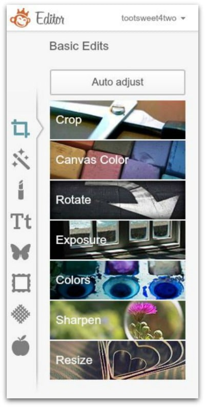
Note that PicMonkey defaults to “Basic Edits” – see the arrow to the right of the crop box with handles? More on this below…
When you click on each one of these basic navigational buttons, the choices change under each and the sidebar navigational toolbar expands to include a vertical scrollbar. PicMonkey regularly updates and adds even more photo editing features on a regular basis.
With so many choices, where do you start?
With the basics, which is what we’ll cover in this tutorial…just enough to whet your appetite and get you excited about exploring more on your own!
Let’s get started:
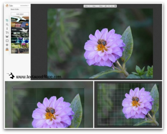
The photo above is a collage, which is covered in Part 5 of this series. When you upload a photo from your computer’s hard drive, Dropbox, Facebook, or Flickr, your photo will appear on a “dashboard” and the navigational tools will be on your left. Your dashboard will look like the photo in the top half of the above collage. I’ve uploaded a flower with a bee from my personal collection of photos for this tutorial.
I always start with the “Basic Edits” because while I’m a decent photographer, I’m not a great photographer and I usually want to make my photo even better, if possible. PicMonkey defaults to “Basic Edits” and the choices under this section (which are all free) include:
- Crop
- Canvas Color (covered in Part 4 of the series)
- Rotate
- Exposure
- Colors
- Sharpen
- Resize
In the flower photo above, the first thing I did was “Crop” the photo. When you select “Crop”, a grid opens over the center of the photo (bottom left of collage). This grid allows you to move it by clicking, holding and dragging the grid across your photo or by resizing your crop using the handles in each corner of the grid.
You can also crop your photo by hovering over the crop box perimeter and waiting for a two-sided arrow to appear. By clicking, holding and dragging on the line, you can crop your photo larger or smaller. Once you are finished cropping, click on “Apply”. You can also “Cancel” plus, if you make a mistake and want to start over, just use the back arrow (undo arrow) at the top of your PicMonkey dashboard!
In the flower photo above, bottom right corner, I’ve selected the “Rotate” button. A grid with tiny boxes (tinier than the “Crop” feature) appears when you click on the “Straighten” button as you hold and drag it, left or right. This feature allows you to actually straighten a photo that might be slightly off kilter. The grid lines provide a visual reference that helps to determine how much to straighten.
In addition, you can actually rotate a photo. If you’ve uploaded a photo that is sideways or upside-down, this tool allows you to fix that without opening another software photo editing program.
In the photo above, I also corrected the “Colors” with the “Auto Adjust” feature, making this photo slightly “warmer”. I did not adjust the “Exposure” (“Exposure” is covered in Part 3 of the series) nor used the “Sharpen” tool and did not “Resize” the photo (“Resize” is covered in Part 4 of the series).

Now we are going to add some special “Effects”. The photo above is another collage. There are so many choices under “Effects” that there was no way to show them all! This collage captures a few of the available choices.
You will notice that some of the choices have a little white crown in the bottom left of the “effect”. This indicates that those features are the ones available for a fee with the “Royale” upgrade. For purposes of this tutorial, I’ve chosen a free effect – Focal Zoom. Here are the steps I took to create the burst effect of this flower photo:
- Click on Focal Zoom
- A circle appears that allows you to move it by clicking, holding and dragging
- On the “Focal Blur”bar, I dragged it to 100%
- On the “Focal Size” bar, I dragged it to 67%
- On the “Edge Hardiness” bar, I dragged it to 73%
- On the “Fade” bar, I dragged it to 39%
- I clicked on “Apply”
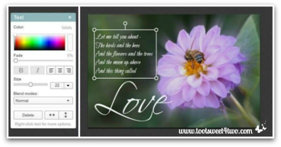
Next, we will add “Text” to this photo. The above photo is a collage. When you click on “Text” from the navigational toolbar, so many choices appear that it can overwhelm you!
Decisions, decisions…how do you choose? The easiest answer to me is just choose any one of the simpler text fonts and click on “Add Text”. When you do, a text box appears on your photo and a pop-up text editing box appears on the right side of your dashboard (in the collage above, the text editing box is on the left).
Click your mouse inside the text box on your photo and start typing. Once you have finished typing what you want on your photo, choose a font by actually clicking on the entire set of words (they will be “selected” in blue) and click on the font choices until you find the perfect font for your project!
NOTE: all words typed within the text box will be the same font, size and color. To have words and individual letters in different fonts, sizes and colors, you need to open new text boxes for each different word or letter (I did this with the word “Love” in the photo above).
You can also move your text anywhere on your photo by clicking, holding and dragging the text box. And, you can add lines of text on different lines by hitting your “enter” key after every line. Plus, using the handles on the text box, you can rotate your text – even upside down!
Not only can you manipulate text as I’ve described above, but you can increase the size of your text either in the text dialogue box (located on the right of your dashboard, but on the left in the photo above) OR by clicking, holding and dragging the handles of the text box in your photo. And, the text box in your photo can be adjusted by hovering over it and using the double-sided arrow to drag the box.
Text defaults to black. You can change the color of your text by selecting the text and choosing the color from the “Color” box. In addition, you can “Fade” your text, justify text either left, right or center, fiddle around with the “Blend Modes” PLUS turn text backward with the horizontal arrows or upside-down with the vertical arrows!
Lastly, you can move the text box anywhere on your photo by hovering inside the text box and waiting for the 4-sided arrow to appear. Click, hold and drag your text box anywhere on your photo and release to set it in place.
Whew! So many super cool things to do!
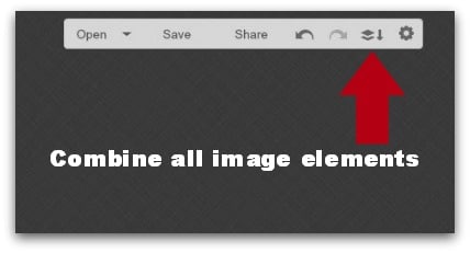
Once you have added all the overlays to your photo that you want, click on “Combine all image elements” at the top of your dashboard to lock all the elements on your photo. Here’s a picture:
Now let’s add a frame.
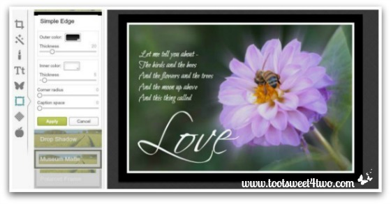
When you click on “Frames”, a drop-down box appears with so many choices! For this tutorial, I’ve selected “Simple Frames”, which is a free feature. The frame around the flower photo above is the “Simple Frames” default, which defaults to a black frame and a white matte. At this point, you can do the following:
- Change the outer color
- Adjust the thickness of the out frame
- Change the inner color
- Adjust the thickness of the inner frame
- Round your corners by using the “Corner Radius” tool
- Add caption space on the bottom of your photo (if you don’t want to put words on the actual photo, you can add them in this “Caption Space” area)
Whatever you decide to do, also click on “Apply” to lock in your changes.
Here’s my finished photo:

Ready to send this special little card to a special person! Now’s your chance to upload a photo and create your own magic with the monkey!
Stay tuned for the rest in the series:
- PicMonkey Basics: Touch Up a Photo
- PicMonkey Basics: Design Your Own
- PicMonkey Basics: Create a Collage
Tootles,

Related Posts:
(other PicMonkey tutorials)
- Call of the Wild
- Here Comes Peter Cottontail – A PicMonkey Tutorial
- How Did You Do That? A PicMonkey Halloween Tutorial
- How to Make a Horizontal Photo a Pinterest-friendly Vertical Photo Using PicMonkey
- How to Make Easter Placecards for Your Holiday Table in PicMonkey
(and your gift from PicMonkey)
Wow! Thank you Carole for all your hard work in making this series. I looked all over their site and couldn’t find anywhere to start.
You’ve given me a lot of information so it will take a few days to sink in and make sense so that I can use it.
I can hardly wait to get started!! 🙂
You are very welcome! I’m so glad you think this series is useful!