Welcome to PicMonkey Basics: Design Your Own, the 4th post in a five-part series about PicMonkey, the easy-to-use, online photo-editing site that has taken bloggers (and others) by storm! If you missed the first three tutorials in this series, here’s your chance to catch-up:
Go ahead and read them – I’ll wait {grin}.
The Design Your Own feature is a relatively new feature from PicMonkey. Users asked and the monkey responded! In fact, the monkey jumped through hoops (or maybe trees) to make it happen! And, users, in turn, jumped for joy when this new feature was released.
I use this feature all the time to create graphic images for my blog, like the one at the top of this post. Sometimes, a photo just isn’t right for a particular blog post and a graphic image is more appropriate. Plus, if you are the creative type, then this feature will soon become one of your favorite things about PicMonkey.
Let’s get started…
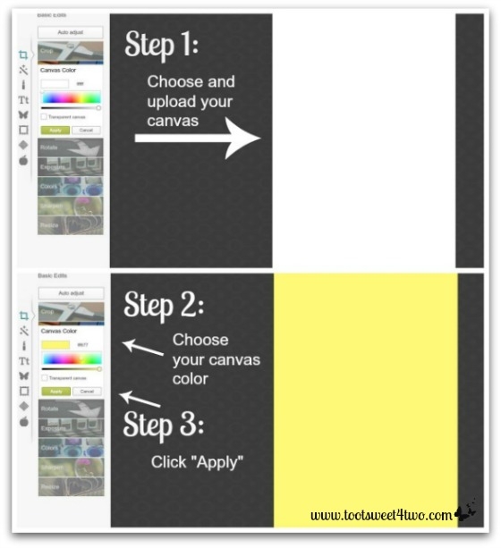
Start by selecting a canvas size. If you actually know the size of the canvas you want to create, choose “Custom” and enter the pixel size in both the vertical and horizontal pixel boxes. You can “Resize” any of the canvases you select, so don’t worry and stress too much about the size you select.
As you create your graphic, you may completely change direction and decide to go from vertical to horizontal or vice versa, and the monkey allows you the flexibility of doing that.
I like to make the majority of my photos and graphics a Pinterest-friendly vertical, because, after all, it’s all about Pinterest (and PicMonkey) these days!
Once you have chosen a blank canvas, PicMonkey will load a white canvas to your dashboard and default to the “Canvas Color” tool. The color graph bar offers a myriad of options. Since it’s a warm sunny day here in beautiful SoCal, I decided to go with a nice sunny, lemony yellow. Be sure to click “Apply” once you have chosen your final color.
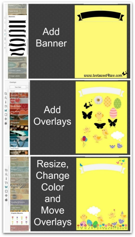
Now it’s time to add overlays. I’ve decided that I want a banner at the top of my graphic. So, in the top photo above, I’ve chosen an arched ribbon banner.
Then, I started going through all the overlay choices and selected ones with a “Spring” theme. Every time you click on an overlay, it is added to your canvas. You can see by the middle photo that I went hog-wild on the overlays!
In the bottom photo, I started resizing, changing the color and moving my selection of overlays. By clicking on each little overlay, a text box appears around the overlay, allowing the user to resize it by dragging the corner inward to make it smaller or dragging the corner outward to make it larger. Plus, by clicking on the overlay and holding it, the user can drag it into position.
Note that I did the following:
- Changed the banner color from the default black to white
- Decided not to use the daisy or the balloons and deleted them
- Changed the color of the Easter eggs and moved them to the bottom of the canvas
- Added a flower border by choosing some whimsical flower overlays, resizing them, duplicating them (right click on the overlay and a drop-down box will appear; choose ‘duplicate overlay’ to create an exact copy) and changing the colors on some of them. Then, I moved them into position at the bottom of the page by clicking on them, holding and dragging.
- I added a party hat to one of the chicks!
- Changed the color of the butterflies, resized them and moved them into position.
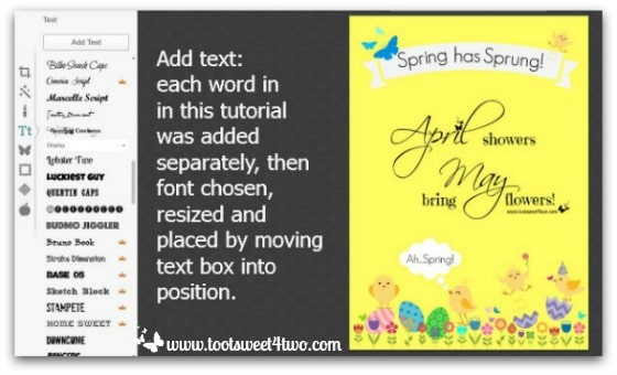
Next I added text. I typed each word is a separate text box. This is a little time-consuming, but to place text in an arched banner, each word needs to be a separate word in order to rotate the word inside the text box (using the text box handle at the top) to fit the curve of the banner. Plus, if you want certain words to be different sizes or different fonts or different colors, they must be added separately because all words within a text box can only be the same size, color and font.
Notice, too, that I decided to duplicate the jumping, bouncing chick and include one in the upper right corner over the word “Sprung”. Plus, I decided to resize and move most of the butterflies to the bottom of the page fluttering over the flowers.
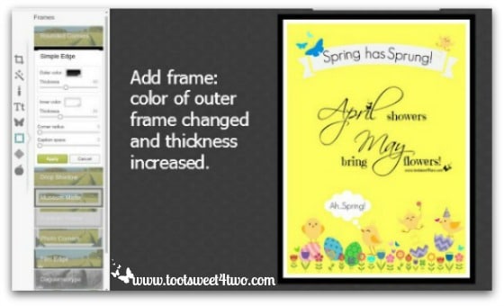
Now I have more choices – I can leave this canvas just as it is, or I can add a frame. I decided to add a frame. I chose “Simple Frames” because it is one of the free choices. It defaults to black. At this point, I can do the following:
- Change the outer color – I changed it to blue
- Increase or decrease the thickness of the outer color – I increased it slightly
- Change the inner color – it defaults to white and I left it white
- Increase or decrease the thickness of the inner color – I increased it slightly
- Round the corner by using the “Corner Radius” tool – I didn’t do this, but left my canvas with right angles
- Add caption space at the bottom by using the “Caption Space” tool – I didn’t use this tool either, because I put text inside my canvas
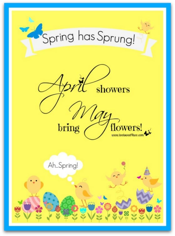
Here’s my finished Spring has Sprung card! Isn’t it cute? And, it was so much fun!
I know readers are thinking, “she’s a bit of a nut job and a tad touched in the head, because it’s not Spring, it’s Summer!”
Well, sweet peeps, you would be right (touched in the head and it’s Summer!). When I originally wrote this post, I did it as a guest blogger over at Creative Income Blog.
In fact, this whole series ran over at Creative Income Blog! Here’s a link to this one: How to Use PicMonkey – Designing a Graphic. When guest posting on another site, usually there is a timeframe that needs to elapse before you can use the material on your own blog. And, being the lazy person I am, I didn’t want to change this tutorial much! Plus, this Spring has Sprung graphic is just so darn cute and I didn’t want to wait until next year to use it!
So, here’s some “bonus” content for you, my sweet peeps:
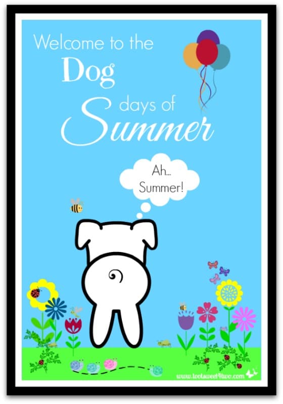
PicMonkey doesn’t have a cute little dog (yet) except for the little puppy face located under “Ordinary Beasts” in the “Overlays” section. But, I wanted my dog to have a body! What to do? What to do? I put his adorable face on a blank canvas and then decided to use the round circle in the “Geometric” overlays to create his body. But, what could I use for feet?
I’ve got it! I’ll use the cute little bunny face in the “Ordinary Beasts” overlays and turn him upside down!
What about a tail? By George, I’ve got it! I’ll use the curlicue garnish and “white out” the part I don’t want!
Here’s a peek at my inspiration board:
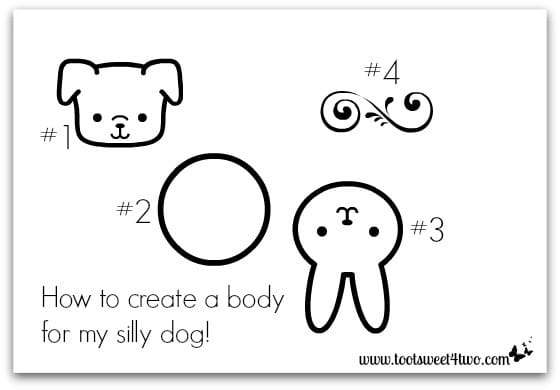
- Cute puppy face in “Ordinary Beasts”
- Round circle in “Geometric”
- Bunny in “Ordinary Beasts” turned upside down
- Curlicue in “Garnishes”
While playing around with this, when I moved the upside down bunny under the puppy’s face, I realized I could cover up half his face and it would look like we were seeing the back of the puppy! Here’s what I did:
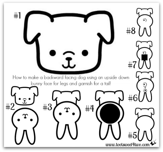
- Choose the puppy face
- Add a bunny and turn it upside down and move it close to the puppy face
- Move the upside down bunny over the puppy’s face
- Add a circle, size it to cover the bunny’s upside down face
- Make the circle white
- Add the curlicue garnish, turn it sideways and resize it to fit within the bunny’s face (so you can “white out” part of it)
- Choose a geometric rectangle or square and resize it to fit over the part of the curlicue you want to “erase”
- Change the geometric box to white
Then, choose the “combine all image elements” to merge them together.
And, there you have it: backward-facing dog (is that a yoga pose?).
Now open your blank canvas and have some fun creating and designing your own card, banner, graphic, Facebook cover or free printable for your family, friends or your blog’s readers!
Stay tuned tomorrow for the final post in this series – PicMonkey Basics: Create a Collage!
Tootles,

Related Posts:
(other PicMonkey tutorials)
- Call of the Wild
- DIY Valentine Bookmarks
- Here Comes Peter Cottontail – A PicMonkey Tutorial
- How Did You Do That? A PicMonkey Halloween Tutorial
- How to Make a Horizontal Photo a Pinterest-friendly Vertical Photo Using PicMonkey
- How to Make Easter Placecards for Your Holiday Table Using PicMonkey
(and, PicMonkey’s gift to you!)
Leave a Reply