
Welcome to the third post in my 5-part series about analyzing, understanding and utilizing the basics of Google Analytics. If you missed the first two post in this series, you can catch up now by clicking these links:
When I started blogging in the summer of 2012, I knew “nothing about nothing.” All I knew is that blogs were fascinating and wonderful places to visit and I wanted to be a part of that “tribe”. It wasn’t until 3 months later that I learned that I should install Google Analytics on my site in order to track visits to our site.
By installing Google Analytics on a blog or website, learning to analyze, understand and utilize the basic information available through reports and the metrics offered, bloggers are one step closer in helping their growing blog morph into a business.
Please note that this post makes the following assumptions about you, the reader:
- The reader has a blog
- The reader’s blog is a business
- The reader has installed Google Analytics
- The reader has limited experience in using Google Analytics
When you first log on to Google Analytics, the left side of your screen is a navigation sidebar with drop-down menus. We have covered several of those navigation aids in the first two parts of this series and this post focuses on the Audience report. Here’s a picture:
![]()
Audience
When you click on each section of the main navigational menu, a drop-down window opens cascading down the page listing multiple reports that are available to study. The Audience report does the same and provides the following options to explore:
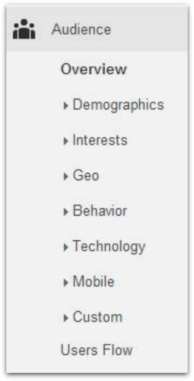
- Overview
- Demographics
- Interests
- Geo
- Behavior
- Technology
- Mobile
- Custom
- Visitors Flow
In addition, 7 of the 9 drop-downs listed above provide even more drop-downs to explore! With so much information available at your fingertips, obviously it is not possible to cover all of these unique areas in this post without this post becoming a 10,000 word term paper!
So, this post focuses on the Audience Overview report. But, I encourage you to click on the drop-downs in your sidebar navigational menu and familiarize yourself with the other available reports.
Soapbox Sidebar: Note that many of the additional drop-downs are either “user defined” or require additional “enabling” and “validating” to activate or require learning to use Webmaster Tools. But, there are so many reports available by just installing Google Analytics that you may not ever need to create “user defined” reports or “enable” or “validate” tracking code!
For many of us, the basic information provided is just fine! {grin – done with soapbox sidebar!} Moving on…
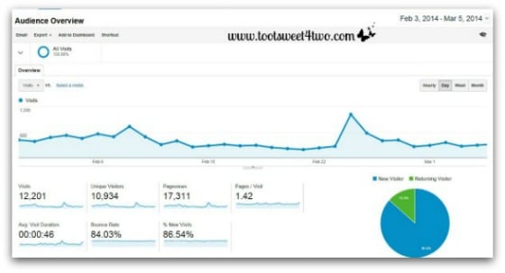
The Audience Overview report (above) gives the blogger a snapshot of activity on their site. By changing the date (located in the upper right corner of this report and all the other reports) to daily, weekly, bi-weekly, monthly, annual (whatever date parameter the blogger needs), the line graph, pie chart and numbers will change. The above photo shows one month.
At a glance, the report provides several types of metrics to use in analyzing your data:
(1) a line graph of traffic over the specified time period
(2) a pie chart to show the percentage of new versus returning visitors
(3) plus specific numbers for the following:
- Visits – total number of visits to your site
- Unique Visitors – total number of unique visitors to your site
- Pageviews – total number of pages viewed on your site
- Pages per Visit – average number of pages viewed per visit
- Average Visit Duration – average visit length of all visitors
- Bounce Rate – percent of single-page visits
- % of New Visitors – percent of total visitors who visited your site for the first time
As you will note in the line graph, my traffic spiked to an all-time high on February 24th. What drove 1,026 visitors to my site that day? Of course, I wanted to find out! So, after further analyzing the data available on Google Analytics, I determined that the majority of the traffic arrived on my site because of my Peach Pineapple Dump Cake recipe.
But, why Peach Pineapple Dump Cake, I wanted to know? It’s one of my older recipes from my early days of blogging and the photo was taken with an iPhone! After some further research, I learned that the website, All Free Casserole Recipes (part of the powerhouse content aggregator, Prime Publishing), put a link to my recipe in their newsletter! Imagine that; a newsletter helped drive significant traffic to my site in one day!
I have written about my symbiotic relationship with Prime Publishing and their various sites, including All Free Casserole Recipes, multiple times in my Monthly Income Reports. If you are a food blogger and are interested in learning how to work with them to help drive traffic to your site, check out these earlier posts on my blog:
- Monthly Income Report – May 2014
- Monthly Income Report – April 2014
- Monthly Income Report – March 2014
- Monthly Income Report – February 2014
- Monthly Income Report – January 2014
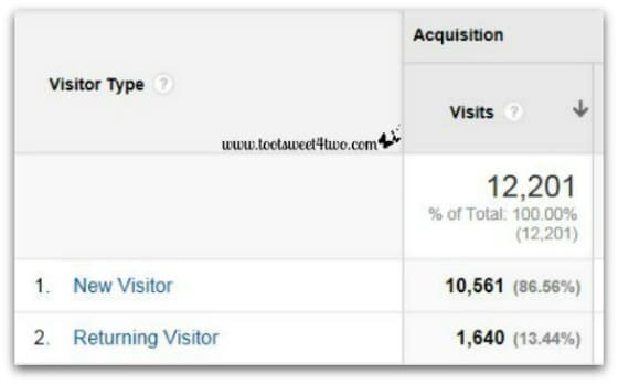
As you will note from the pie chart in the photo above, new visitors far outweigh returning visitors to my site. This is not unusual. At a blogging conference I attended, one of the speakers told the audience that your visitors will “turn over” every 3 months. That’s one of the reasons why as a blogger, you should provide new content to your site on a consistent basis.
Also, notice that the “Average Visit Duration” to my site was a whopping 46 seconds! In my early days of blogging, it was not unusual for visitors to stay 5 to 10 minutes! Now they stay under one minute.
Why?
Because in my early days of blogging, my blog was read by friends and family who loved me! So, they had a vested interest in staying on my blog awhile to see what I’d been creating. They still visit me, they still love me, but my traffic has grown so much in the last 6 months that now new visitors outweigh returning visitors.
While the 46 second “Average Visit Duration” isn’t stellar, I’m not too worried about it. I’m not worried because I know that in our “toot sweet” lives, visitors to web sites want to find the information they need and then move on. So, visitors found the Peach Pineapple Dump Cake recipe they wanted, saved it or printed it and moved on.
In the blogging world, this is a truism:
you have 10 seconds to make an impression
Note, too, that our “Bounce Rate” is high, which tracks with the “Average Visit Duration” and the truism I just shared!
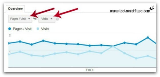
By changing the metrics from the drop-downs available under “Overview,” you can further analyze data. As I’ve said before, Google Analytics provides every which way imaginable to slice-and-dice your data!
In addition, the Audience report provides opportunities to view the following unique reports and metrics:
- Demographics – who is visiting your site defined by age and gender
- Interests – what they are visiting defined as traffic by affinity and other categories
- Geo – where they are visiting from including country, territory and language spoken
- Behavior – are they new versus returning? How many times do they visit? How many days go by before they return? How much time do they spend on your site? These and more questions are answered by the Behavior report within the Audience report.
- Technology – what browser are they using? This information could be a critical component in a site design/redesign. What service providers do they use to access your site?
- Mobile – this tells you what type mobile device, brand, service provider and more. More and more visitors are accessing web sites through a mobile device or tablet. Understanding how your site looks when opened from a mobile device is key.
- Custom – visitor activity reports that are custom designed by you for your blog/web site. These require that you understand code because they require that you insert tracking code to enable them. If you don’t know coding, you will need to hire professional help to use these reports.
- Visitors Flow – per Google, this report “is a graphical representation of the paths visitors took through your site, from the source, through the various pages, and where along their paths they exited your site.” It is a fascinating chart to review, but complicated to follow.
I love looking at this report:
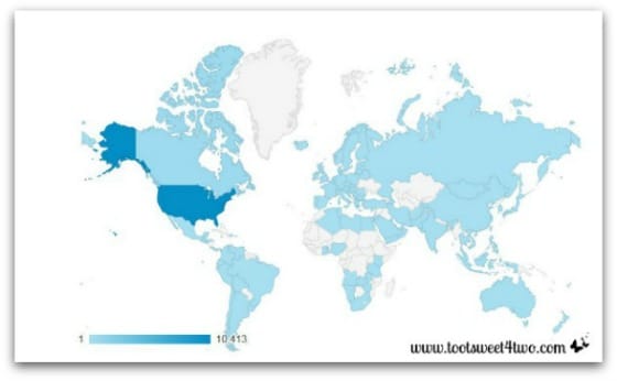
This is a map of the world showing from where visitors are coming. You can find this map under the “Geo” down-drop under the Audience report. Use your mouse to hover over the map and it will tell you the specific country/territory and the number of visitors. All areas in blue represent visitors to your site! The darker blue are the most visitors, which is obvious because I’m an American blogger. But the lighter blue colors represent visitors from those countries! So cool!
Stay tuned for the rest of the series…
- Google Analytics: Analyzing and Understanding the Acquisition Report
- Google Analytics: Analyzing and Understanding the Behavior Report
Tootles,

Related Posts:
(other posts about blogging)
- 2 Girls with an Idea
- 10 Ways to Improve Your Blog’s Design
- 17 Girls and a Baby
- A Fresh Start on a Budget
- Breaking the Rules
- How to Add a Featured Image Thumbnail to a WP Post
- How to Make a Horizontal Photo a Pinterest-Friendly Vertical Photo in PicMonkey
- Liebster Blog Award
- New Year, New View
- Nothing Ventured, Nothing Gained
- Under Construction
- We Heart the Snipping Tool
Leave a Reply