Are you considering a blog redesign? I am. Since Tiffany’s “retirement” a year ago from Toot Sweet 4 Two, I needed to change the header at the very minimum. After a year of denial (denial that she’s no longer my partner {sad face}, denial about needing to “rebrand” Toot Sweet 4 Two from a 2-person show to a 1-person show, denial that I’m a food blogger, when I want to be more than that), I decided to let my denial go and just get on with it!
So, while contemplating a redesign of Toot Sweet 4 Two, I decided that I’m not ready for the financial commitment of a major overhaul. Instead, I’ve settled for a simple redesign of my header, updating my “About” page and made a minor change to the footer.
But, during this process of considering a blog redesign, I spent time analyzing what does work on my site. So I thought I’d share these 5 tips to improve your reader’s experience. After all, readers are the lifeblood of a blog and making your site easy to navigate, so that readers come back again and again, is one of the keys to a blog’s success.
If you are a blogger, like me you probably started your blog with a free template. And, for many months, the free template worked just fine.
But, over time, as my knowledge increased on the functional capabilities of blogs, I wanted more. I outgrew the free template. And, with my limited knowledge in blog design and functionality, I visited hundreds of blogs and took notes about what I liked and what I didn’t like in preparation for updating my blog’s design.
During this research time, I noticed one key thing – I was the “reader,” the “visitor” to the blog I was visiting and not the blogger. Bloggers have 10 seconds to make an impression on readers or they are on to the next blog. Approaching my blog’s redesign from the reader’s perspective gave me a clearer understanding of what was missing on my blog. And, it gave me a new appreciation of how to improve the reader’s experience.
So, if you are considering a blog redesign, here are 5 tips to improve your reader’s experience:
Tip #1 – put your face out there and make it easy for readers to follow you
Avatars are great. Talented designers can create all kinds of adorableness for your header. Although we value our privacy, the bottom line is that readers want to “see” who you are. If you don’t put your face in your header, be sure to include a photo of you in the “About” section and/or on your sidebar, preferably above the fold. Then, when readers land on your page, you are either front and center or easy to find.
While you are at it, put your social media buttons and “subscribe to me” box either in your header or on the sidebar above the fold. You want to make sure that readers don’t have to search for ways to follow you. Because, if they have to search for this information, more than likely they will give up and not follow you.
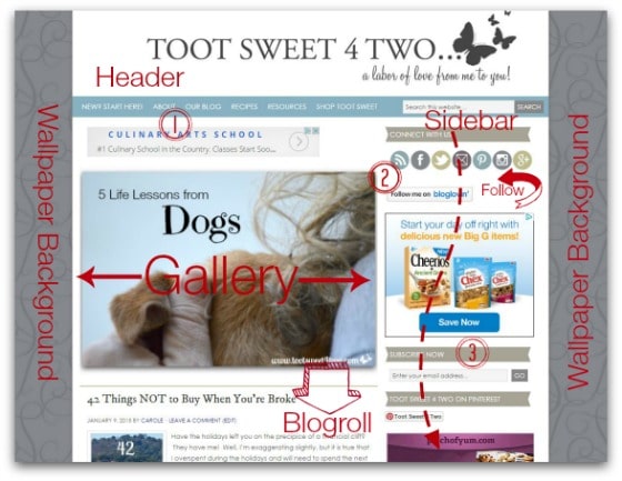
The photo collage above is my attempt to show you how my blog looks, above the fold, when you land on my site. Immediately, the reader (1) sees the header with the “About” on the menu bar (there’s a good size photo of me in the easy-to-find “About” page), (2) the “Connect With Me” social media buttons and (3) “Subscribe Now” in the sidebar above the fold. I have my mini “About” page actually in the footer; I’m thinking about moving that up the sidebar.
The rest of the photo above shows that I have a rotating photo gallery of 7 photos plus a blogroll below, with 10 posts to choose from (2 weeks worth of current posts).
Tip #2 – Make navigating your blog painless
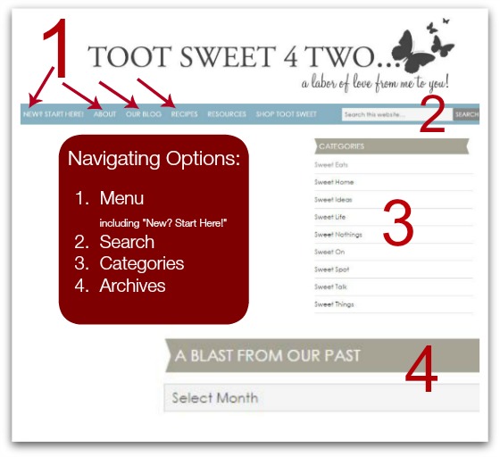
Streamline your navigation. In the photo above, you will note that I have a very basic menu bar (1). Americans read from left to right, so the top left of your blog is prime real estate. I’ve placed a “call to action” in the top left menu bar called “New? Start Here.” When you hover over that call to action, a drop-down menu appears that gives the reader the following choices: multiple ways to view “Archive” pages, my “Contact” page, a “Disclosure” policy and the PR/Media page, which I call “Tooting Our Horn” (old hold-out from the days we when were two; thus the “our” instead of “my”).
To the right of “New? Start Here” is “About” followed by “Blog” and to the right of that is a separate section for “Recipes”. Then, to the right of “Recipes,” I have “Resources” (still under construction) and to the right of that is “Shop Toot Sweet”, which is my Amazon affiliate shop.
And, (2) is a “Search” box, which rounds out the Menu Bar. Simple – only 6 choices (7 if you count the “Search” box).
Please note that the photo above is not “to scale”. The “Categories” (3) are further down the sidebar. The “Categories” define the types of posts I do, but they really don’t have any significance to readers, unless they are a regular reader. If the reader is a regular reader, they understand the “structure” of our blog and these “Categories” would have meaning to them from a navigational perspective. And, if they are new readers, who just want to explore our content, clicking on our “Categories” will take them to all the posts in those categories.
I call the “Archives” widget (4) on the sidebar (also much further down the blogroll) “A Blast from the Past”. For the longest time, I didn’t bother to put this widget on my sidebar, because I have a rather robust “Archives” section under our “New? Start Here” menu tab. But, a conversation with a potential advertising network executive changed my mind! The advertising rep told me that advertisers look for that sidebar widget because (a) they want to know how long you have been blogging and (b) they want to know how often you post! Good to know! Widget reinstalled!
Advertisers could care less about the actual posts (well, they do to a degree – they want to know whether you are a craft blogger, a food blogger, a lifestyles blogger, etc. and where you will fit in with their advertising family), but they want to know, at a glance, how long you’ve been around and how often you are creating content. Remember: 10 seconds to make an impression.
Tip #3 – Give your reader choices
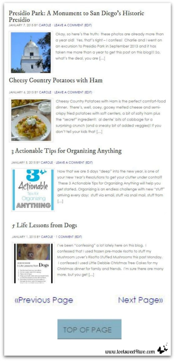
What if a reader isn’t interested in the post you posted that day? But, to see what else you may have posted recently, they have to scroll down the page until they find the next post, and the next one and the next one, etc. What happens if you don’t give them choices? They are likely to leave. Poof! 10 seconds and they are off to the next blog. Give them an opportunity to stick around by giving them choices of reading material. On my blog, I give them 10 snippets of posts (see photo above) to choose from on the front page. I post 5 days a week, so that’s 2 weeks worth of choices.
And, when they get to the bottom of the blogroll, they can choose “Next Page”. When they choose “Next Page” and they are on the “Next Page”, I also give them a “Previous Page” choice.
And, the best of all worlds – I give them a “Top of Page” button at the bottom of our blog. That way they don’t have to use the scroll bar to get all the way back up to the top!
Tip #4 – Make sharing your content easy
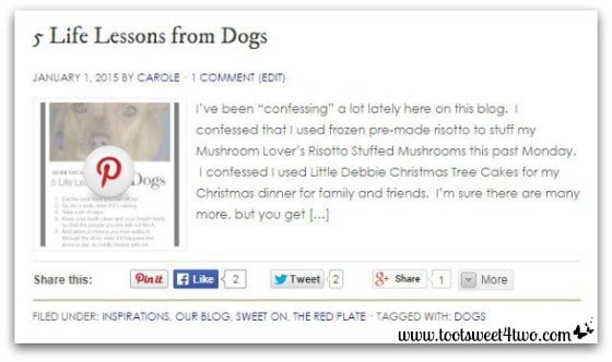
Don’t forget to include clickable buttons to encourage your readers to share your content on social media sites. And, if you are active on Pinterest, don’t forget to install a “Pin It” button on your images so that when readers hover over the image (like the photo above), they have the opportunity to easily pin your content to their Pinterest boards.
Tip #5 – Give the reader options within your post
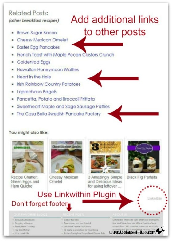
Your reader has read your post and is now at the bottom of your post. Now what? Do they go back to your home page? Do they try to find your archives? Make it easy for them. At the very least, if you have a WordPress blog, install the “Linkwithin” plugin. This cool little feature automatically shares a thumbnail of several of your posts (you set the number).
And, give the reader even more options – type in “Related Posts” and add your own and link back to them. Call it something fun, if you think “Related Posts” is too dry for your blog. How about something like “Want to Read More?” or “Don’t Leave Yet – Read These!”
Lastly, don’t forget your Footer. It, too, is valuable real estate that is often underutilized. Add a “Recent Posts” section to your footer that links to other posts.
So, that’s it for now! If you are considering a blog redesign, these 5 tips will improve your reader’s experience, so that they come back again and again!
Tootles,

Related Posts:
(other posts about blogging)
Thank you for sharing some very useful information! I am a new blogger and just completed a redesign on my blog today using wordpress. Now that I have seen your article I need to go back and fine-tune a few more things but thank you so much for helping trigger the thoughts necessary to make my blog really user-friendly for my readers.
Hi, Sheryl:
You are most welcome! Hope you enjoy blogging as much as I do!
Thanks for writing this post – I have just set up my first blog and I am definitely going to implement some of your advice, I just need to figure out how to do it first!
You’re welcome, Chrissy! Good luck with your new venture. I love blogging and hope you do too!
Hi there, I am so glad that you did a post on blog design. I am currently with blogspot and I cannot figure out which template works for me. I have even been considering having someone create a design for me. I don’t want to get ahead of myself though. Right now, I am enjoying the blog, but I would love to revamp my look as well. Again, thanks for the sharing and the great ideas.
You are so very welcome! I’m glad this post gave you some “food for thought” so that when you are ready for a redesign, you’ll keep the reader in mind! Thanks for stopping by!
Great tips. I really like the “you might also like” section. Thanks for recommending a plug-in. Sometimes plugins can be overwhelming.
I’m glad I gave you “food for thought!” Thanks for dropping by!
Love these tips and your blog design is very clean and clear which I love! Thanks for sharing with Small Victories Sunday Linkup and hope you join us again this weekend! Pinning to our linkup board.
You are welcome! Thanks for the compliments and thanks for dropping by!
All great ideas. Making your blog easy to read and navigate is super helpful when you consider important pieces of a redesign. Nice post! Stopping by from the Merry Monday party.
Thanks, Kirsten! And, thanks for stopping by!
You’ve given me plenty to consider tweaking with my site. Thanks for sharing your insight.
Found you on Merry Mondays
So happy to hear that! Thanks for dropping by!
Thanks for this post, Carole! I’m visiting fro the Merry Monday Link Party at My Pinterventures. Your blog is new to me, but I’m so glad I found you… we are of the same generation. These are great tips!
Hi, Sondra Lyn! Nice to “meet” you! You are the first blogger I’ve met that’s my age! I think we are a rare breed, so it’s nice to know others are out there! Thanks for stopping by.