If you are a regular reader of our blog, I’m sure you have noticed our redesign, which officially launched on February 10th. I want to share with you 10 Ways to Improve Your Blog’s Design just in case any of you out there are thinking of starting your own blog. But first, I want to take a moment and give a big shout out to Tana Nelson of Your Marketing BFF {link}, who with her expertise and experience has taken our blog to the next level. Tana, you are the best and we wouldn’t look this good today without your help!

I met Tana at Bloggy Boot Camp in Las Vegas last October. If you want to read any of the stories from our incredibly awesome Bloggy Boot Camp experience, click on the links below:
Tana and I sat at the same table at lunch and struck up a conversation. Tiffany, unfortunately, sat elsewhere (maybe really not unfortunately – she probably sat with other awesome bloggers! She just didn’t get to know Tana!). In our short lunch hour, I felt like I’d met someone who:
-
knew what she was doing
-
knew where she was going
-
and how she was going to get there.
The funny part of this story is that in her own “toot sweet” life (she’s a mom, a wife and runs a business), she forgot to bring business cards! So, I gave her a pile of mine and told her to cross through my name and to write her own information on my cards so that she would have something to hand out! So, from that little gesture of helpfulness, I’m sure that Tana will never forget who I am! Plus, I was getting a double bang for my buck because there was no way, in the short conference day that we had before us, that I was going to network with all the women at Bloggy Boot Camp! By giving Tana my cards for her use, I was distributing to others through her, thereby doubling my coverage!
Tana, pictured above (no, actually, that’s her avatar, but she looks amazingly like that IRL!) is a marketing professional and owns her own company. She listened to our vision and then interpreted it in an affordable manner. Want to know what our vision was (is)?
Our Vision
Our vision was to have a fresh, clean look and structure in black, white and gray (like Dorothy in Kansas) with just a bit of color. When a reader then went to our individual posts, those posts would be full of color (photos) much like Dorothy arriving in the Land of Oz! I think Tana accomplished this goal, don’t you?
The old design, Patchwork, was a free theme that we picked out of the available choices in WordPress that functioned in the way we wanted it to function. But, we had no attachment to the “patchwork” design because Tiffany and I aren’t quilters or sewers. If you are one of our blog followers since the launch date (July 28, 2012), you will know that this is our 5th theme template! In the early days, we also tried out Matala, Cloudy Blue Sky, Warm Home and settled with Patchwork. I think they are all very fine templates; it’s just that in the early days of blogging, we didn’t really know what we were doing, so if we couldn’t get a template to display the way we wanted it to display, we would just move onto another one!!! Here’s a picture of our old themes – all beautiful and free from WordPress.org.
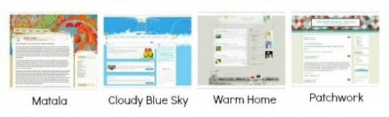
Sorry they’re a little blurry – if you are interested in seeing these beautiful themes in action, check out this WordPress themes site by clicking on the link.
So, what’s to like about our new site redesign? Here’s a list of 10 Ways to Improve Your Blog’s Design and what to like about our new design:
#1 – Put Your Face Forward
Many blogs and websites have beautiful headers and creative avatars. But, people want to know what people look like! So, make sure your picture is somewhere front and center on your blog. We put ourselves right in our header:

#2 – Streamline Your Menu Bar
Our old menu listed our 8 categories. Fine for us, but confusing to readers, especially new readers. Have a clear “call to action” way for new readers to connect with your blog. Our “call to action” in our Menu Navigation button says “New? Start Here”. There is no question where we want new readers to go. What are they going to find under that navigation button? Our “About” and “Contact” pages plus pages of “Archives” to help a new reader navigate our site.
![]()
In addition, our new Menu bar features our Amazon shop, “Shop Toot Sweet”, plus provides a “Search” bar to help locate items of interest on our blog. This redesigned Menu bar provides a clear message to our readers, whether they’re new or returning visitors:
-
they can easily find the most current blog post under “Our Blog”
-
they can find the most current recipe post under “Recipes”
-
they can find additional resources under “Resources” (this is still Under Construction, so stay tuned…)
-
plus they can easily shop at “Shop Toot Sweet”.
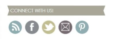
#3 – Provide a clear way for readers and visitors to connect with you and your blog
Make sure that your email, RSS feed, Facebook, Pinterest and Twitter links are easily accessible. Ours are located at the top right, in our sidebar.
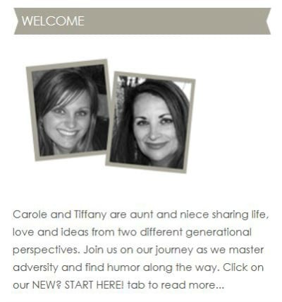
#4 – Provide a Mini Version of your “About” Page
Readers and visitors want to know who you are. Show them front and center so that they don’t have to search for your bio unless they want to read more. You have only about 10 seconds to connect with new visitors. Make those 10 seconds count. Our “mini About” is located under our “Connect with Us” banner on the right side of our blog in the sidebar area.
#5 – Provide a Rotating Picture Gallery
This isn’t really necessary and all blogs don’t have one. But, it certainly is fun AND a good way to provide your readers and visitors with another navigational tool that leads to a post or a category. We are excited about having this new gallery, but are still learning to manage it. Please forgive any ill-fitting pictures as we readjust our photos to align with our new theme and this gallery!

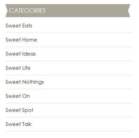
#6 – Streamline Your Categories
We actually have 64 categories, but they all roll-up under our 8 main categories. This is a strategic part of our marketing plan as we develop our brand identify and grow and evolve into the business that is “Toot Sweet 4 Two”. Under our old design, readers could locate each of our 56 sub-categories by hovering over the main categories name. While this is meaningful to us (as owners of our business and creators of this blog), we’ve decided the 56 sub-categories are meaningless to our readers and visitors. But, those 56 categories provide ways to locate similar stories on our blog, so we feel they are important to keep and use, but they are not front and center anymore. And, with 250 other posts already on our site, we may add more sub-categories as we grow, but any additional sub-categories will roll-up under our 8 main categories. Readers and visitors can locate all of our specific posts in our “Archives – By Category” page under the “New? Start Here” button on our menu bar. In the meantime, our “Categories” navigational tool is located on the right side of our blog on the sidebar – clean and simple.
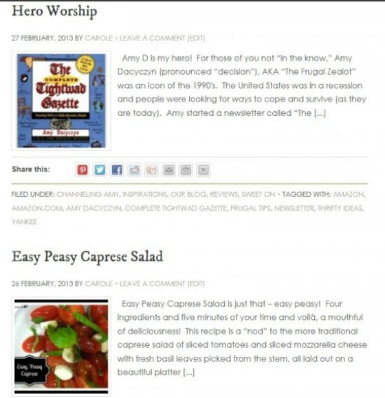
Also, readers can find the Categories, Sub-Categories and Tags of each blog post underneath each individual post. They look like this:

#7 – Provide Readers with Choices
Readers and visitors to a blog want choices. They aren’t always interested in the most current blog post (we, as bloggers want them to be, but the reality of blogging is that readers want to choose). Under our old format, when readers arrived at our “Home” page, they automatically saw the most recent post. In order to view the previous post, readers either had to scroll all the way down the page through the most recent post to get to the previous one, etc. or they had to use one of the old navigational tools to see what they could find. Our new format provides our readers and visitors with choices – 10 of them at a time! With thumbnail pictures and a brief lead-in paragraph, our readers and visitors can scroll down our landing page and choose.
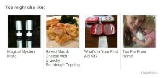
Since choices are what readers and visitors want, don’t overlook an opportunity to provide them with even more choices by installing the LinkWithin plugin. This cool plugin provides your readers and visitors with even more choices of past posts in a thumbnail gallery at the bottom of every post.
And, if that isn’t enough, provide readers and visitors with a way to view older posts; on our blog, all they have to do is scroll to the bottom and click on the “Older Posts” link!

And, if they want to go back, they can click on the “Newer Posts link! 
And, once the reader is inside of a post, there are several things to choose:
If they want to read comments, they click on the “Comments” area under the post’s title.

If there are no comments, this is what readers will see:

If readers want to leave a comment, in either of the examples above, they just click on either “2 Comments” or “Leave a Comment” (whichever is applicable for the particular post the reader wants to comment on) and they will see this box at the bottom of the post:
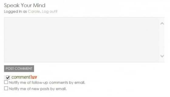
We love comments, so feel free!
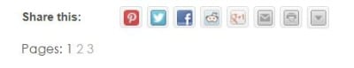
Also, there are many ways to share our content – Pinterest, Facebook, Twitter, etc. and we’ve included the tools to do that under each post:
![]()
And, if the post is a particularly long one, like this post, provide your readers and visitors with Pages so that they can page through the post.

Our “Pages” is a little difficult to notice because it shows up under the “Share this” bar, thus the reason we type “Read more on Page 1, 2, 3, etc.” at the end of each page:
If we can figure out how to put the “Pages” up into the bottom of the post, we will move it!
#8 – Provide Readers with Multiple Means of Blog Site Navigation
So, if these choices aren’t enough for our readers and visitors, we have another fun widget on our sidebar called “Posts.”
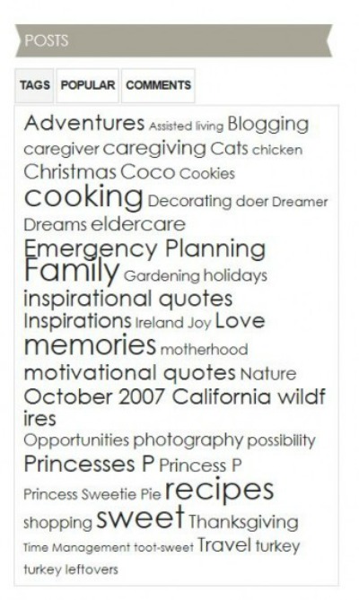
Notice that under “Posts”, the reader is given three choices of how to view the “Posts” represented in this widget. Ours defaults to our Cloud Tag. If the reader clicks on any of the words in our Cloud Tag, the reader will be taken to all the posts that are tagged with that word.
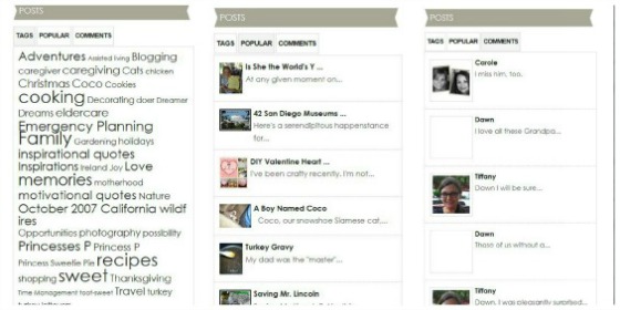
If the reader clicks on “Popular”, this widget provides links to the most popular posts at the moment. If the reader clicks on “Comments”, they can access the most recent comments under posts. We think this is such a cool widget!
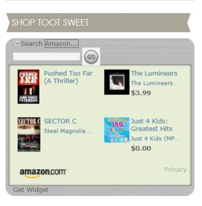
#9 – Give Your Readers Something to Buy
Everyone likes to shop, don’t they? As you know, we’ve recently added our “Shop Toot Sweet” Amazon link. In addition to that feature, our readers can access Amazon through the advertising in our sidebar.
Disclaimer: If you decide to make a purchase through our Amazon link, Amazon will pay us a commission for it. This does not cost you anything more. These commissions help to keep the rest of our content free, so thank you!
Also, include other meaningful advertising that is pertinent to your blog’s content.

Both of these features are located in our redesigned sidebar. More advertisements will appear in the future as we learn how to monetize our blog to provide a revenue stream (look for our Monthly Income Reports in the future).
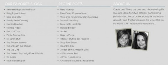
#10 – Take Advantage of Your Footer
A blog’s “Footer” is located at the very bottom of the blog, thus “Footer.” This is valuable real estate often underutilized. Ours was non-existent before our blog redesign. That was because Tiffany and I didn’t know how to alter our footer. It turns out that it is something called “php” and I think HTML, too, which we still know nothing about. Thus the reason for hiring the professional!
Anyway, our new “Footer” has wonderful features:
- Links to our favorite blogs (this will change over time as we discover and add new ones)
- Links to our most recent posts
- And, another “mini About” section.
And, finally, the best footer feature is this:
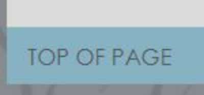
You’ve made down to the bottom of our site and we want to reward you with a fast and easy way to get back to the Top! Cool, isn’t it?
That’s it – 10 Ways to Improve Your Blog’s Design!
Tootles,

Related Posts:
(other blog tutorials)
- 3 Cheap and Easy Ideas for Better Food Photography
- Breaking the Rules
- How to Add a Featured Image Thumbnail to a WP Post
- How Did You Do That? A PicMonkey Halloween Tutorial
- How to Make a Horizontal Photo a Pinterest-friendly Vertical Photo Using PicMonkey
- Monthly Income Report – February 2013
- Monthly Income Report – March 2013
- Monthly Income Report – April 2013
- Monthly Income Report – May 2013
- Monthly Income Report – June 2013
- Monthly Income Report – July 2013
- Monthly Income Report – August and September 2013
- Monthly Income Report – October 2013
- Monthly Income Report – November 2013
- Monthly Income Report – December 2013
- Monthly Income Report – January 2014
- We Heart the Snipping Tool
Thank you SO much Carole for sharing me/my business with your readers! It was a blessing to meet you, form a friendship and work with you. I know you and Tiffany will be successful…because you are great students and are willing to do the work. Success doesn’t come overnight, but you’ve laid the RIGHT brand groundwork that will attract (not repel) your specific clients. So proud of you both! KUDOS and thanks again 🙂
Your Marketing BFF, Tana
Thanks for the great comment and kind words. We appreciate everything you have done to contribute to our continued success!
I’m not familiar with WordPress, but I thought of a way to bypass the oddly placed “pages” links. Keep the text you have stating “click on page 2” but link that text to page 2. Then your reader can follow the link rather than scrolling down to finds the page tool. It seems WP makes the subseqeunt page links simple like https://www.tootsweet4two.com/10-ways-to-improve-your-blogs-design/2/ just adding the late number ar the end. I’d be happy to help further if you need it.
Thanks for the excellent idea, Elizabeth! I’ll give that a try and use it as a “work-around” until we can move the “Page 2” link to the correct location!
In updating my site I discovered the LinkWithin widget is the issue. It can easily move under your labels by adding this code to your html just after the label section of your post footer. <div class=”linkwithin_div”></div>
Thanks, Elizabeth! How thoughtful of you to share this info! We’ll give it a try.
Excellent list of 10. I learned a few new things about your blog that I didn’t know and learned the “whys” of all the other changes that I did know about. I’m so proud of you and Tiff, this is truly a professional undertaking, and you will end up famous one day (I hope).
Awww, shucks! Thanks so much for the nice comments. I’m so happy that you like our new (and professional-looking) design!